
UX Case Study
REO: Enhancing Infant Development Mobile App
Project
Overview
Reo is a mobile application for infant development that I developed as part of my University of Washington Informatics course. I worked on this project with my colleagues from start to finish, using research, ideation, and UX design principles.
Duration
3 months
Methods
Surveys & Interviews, Persona & Scenario, Wireframes, Prototyping
Role
UX designer & Researcher
Tools
Canva, Figma, Proto.io, InVision
Context
During my undergraduate years, I employed as an Infant Teacher at KinderCare Education for four years, where I had daily interactions with babies and their parents. While working there, I often observed a significant communication problem between parents and teachers based on an antiquated check-in and out system. As a result, I wanted to create a prototype to assist child care centers in keeping track of attendance. I proposed implementing a prototype that would enable child care centers to track attendance, daily activities, and their infants' developmental progress.
Research: Conduct thorough research on existing attendance tracking systems and gather insights from parents, teachers, and administrators to understand communication challenges. Explore relevant literature on infant development to inform the solution.
Define: Clearly define the problem of communication gaps between parents and teachers due to outdated systems. Identify essential requirements for an effective solution, such as real-time attendance tracking and developmental progress monitoring.
Ideate: Brainstorm potential solutions and features, including a mobile app for parents to check-in/out and receive updates, along with a dashboard for teachers to monitor activities and milestones. Focus on user-friendly interfaces and automated
Prototype: Develop a basic prototype of the mobile application emphasizing simplicity and accessibility. Include key features like check-in/out, activity logging, and milestone tracking, ensuring ease of use for both parents and teachers.
Iterate: Test the prototype with a small group, gather feedback, and make iterative improvements based on user input. Continuously refine the prototype through multiple iterations until it meets the needs and expectations of the target users and aligns with industry standards.
Process
1. Research
Competitor Analysis
To get a deeper understanding of the competitive climate, I conducted research on two of the most popular child care apps on the market. I discovered that, while both provided a fair amount of information, there was a lack of features and usability that could have enabled parents to learn more about their child's day.
Surveys & Interviews
The goal was to understand how teachers made use of the current existing analog methods, what features they felt were most important, and what problems they were having. Therefore, I conducted a survey of 20 teachers and 10 parents. One of the essential questions asked to enhance the service provided to both clients was which app features they would enjoy the most and why.
Key finds & Insights
The surveys and interviews helped me learn more about my users' needs and frustrations, and I was able to extract a few key findings that would shape the project.

2. Define
Problem Statement
Parents need secure and open-source knowledge about their children. Teachers, too, need a protected way to record data and an easy-to-understand innovation so they can make safe decisions and keep track of critical information during the day.
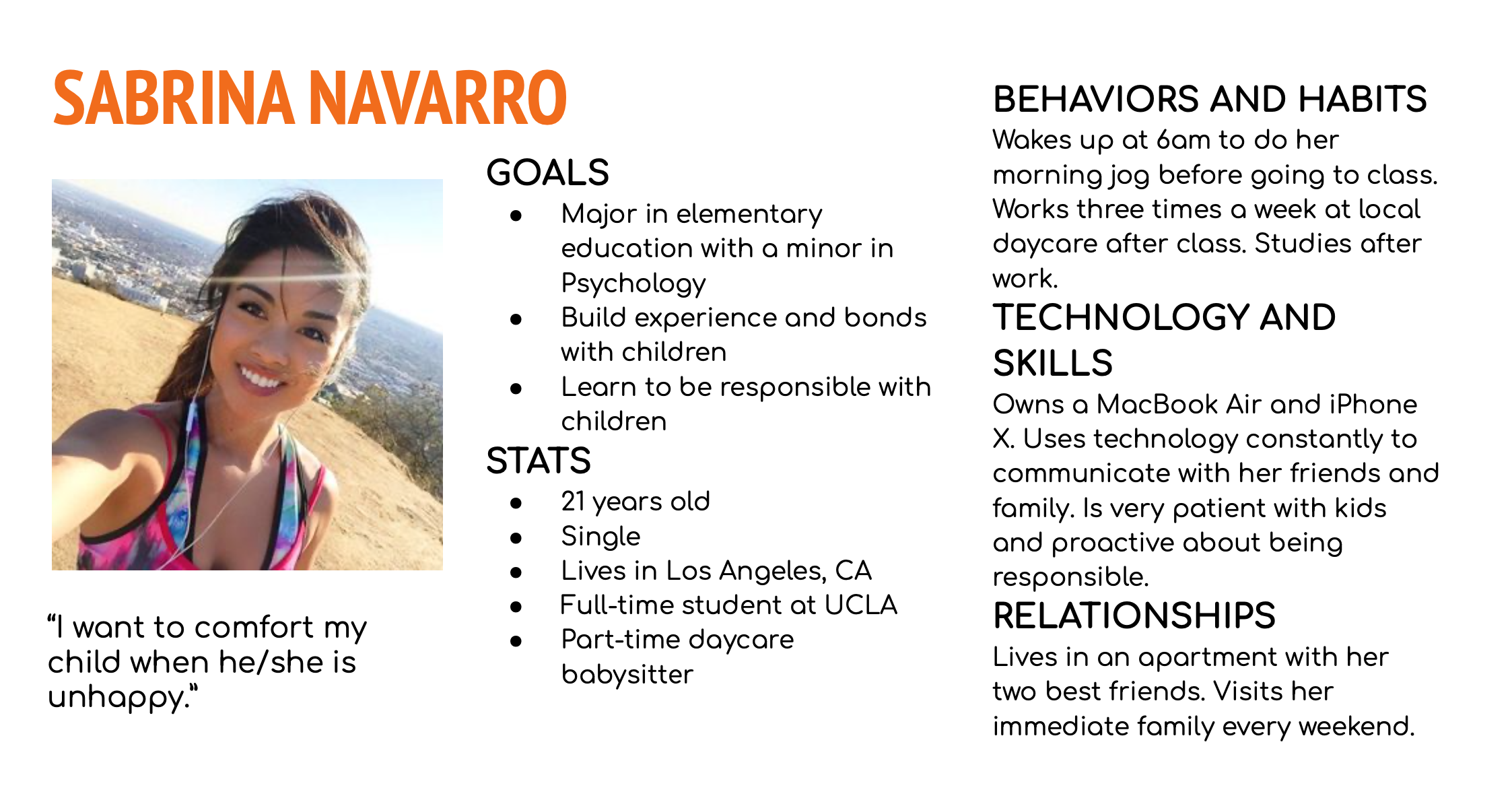
User Personas
Since accessibility was one of the main results from the user research, two user personas were developed. I went back to these user personas often to remind myself of their concerns and challenges, and to maintain a user-centric perspective during the project.

Core Features
With a better idea of my user's idea and needs, I identified three core features that I wanted to focus on the product.

3. Ideate
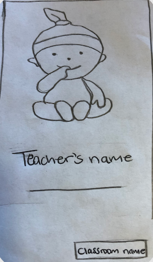
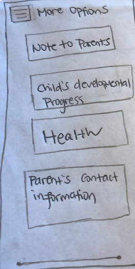
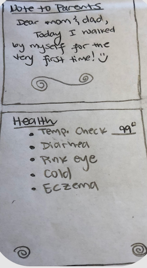
Low Fidelity & Mid Fidelity Wireframes
The main goals of this project are simplicity and convenience. Therefore, the number of screens on the application was kept to a minimum and I chose to focus on showcasing the most important features. I began with pen and paper wireframes, creating different iterations of each screen until I found a mix of features and elements that I felt best suited the user's needs and were as intuitive as possible.
Then, using Figma and Proto.io, I built a mid-fidelity version of these wires, as well as a clickable prototype on proto.io, and sought parents and teachers to test the model.


4. Prototype
Usability testing
This phase was the game charger - by conducting usability tests, I was able to refine what users were finding useful and completely change what they didn’t react well to. Users were asked to complete a few scenario-based tasks to assess the app's key features, and they were also asked how they felt about it overall.
Key findings
I made notes of the positive and negative feedback so that I knew what areas to continue developing and what areas required improvement.
Positive
Colors and fonts were enjoyed among users.
Users were able to complete tasks in a timely manner.
Users were able to navigate with ease.
Negative
Users had some difficulty finding information about children.
Users were unsure when to expect live alerts.
Users were unsure if there were any restrictions on the number of children they might add to a classroom.
5. Iterate
Design challenge
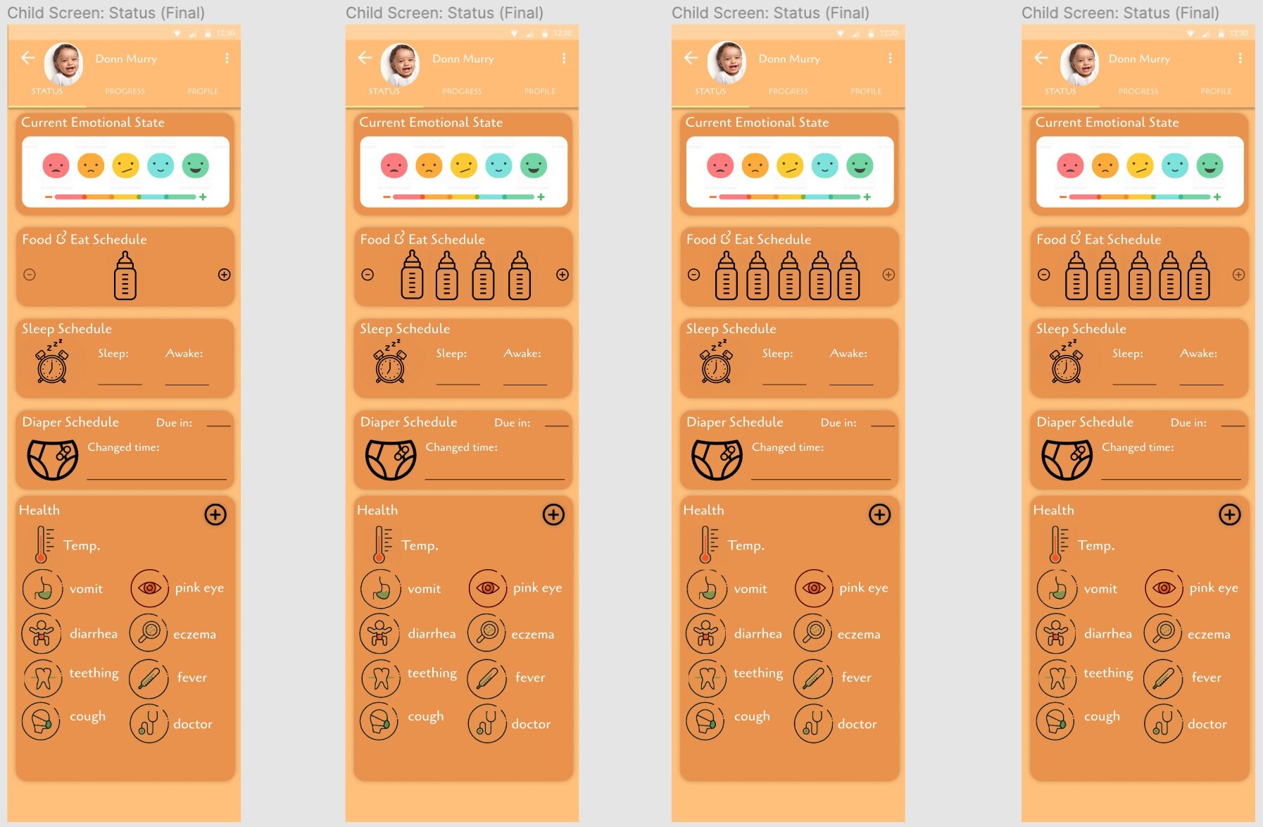
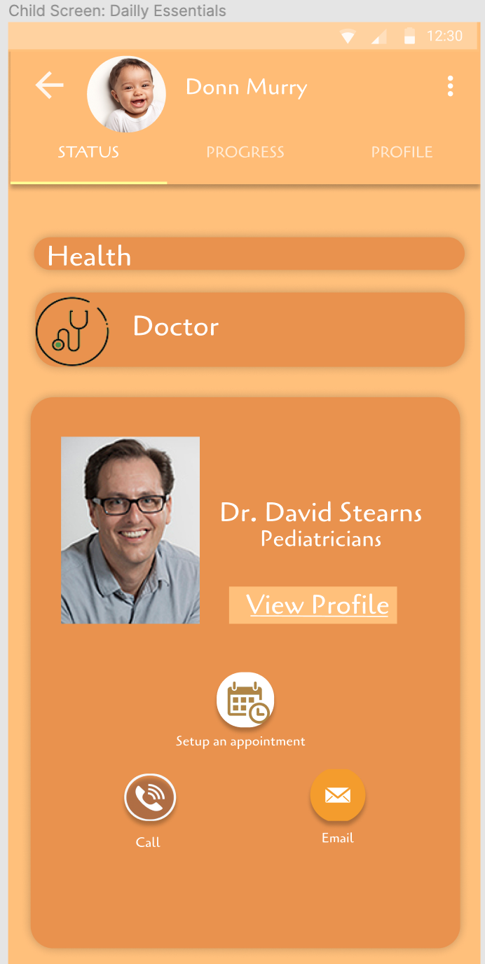
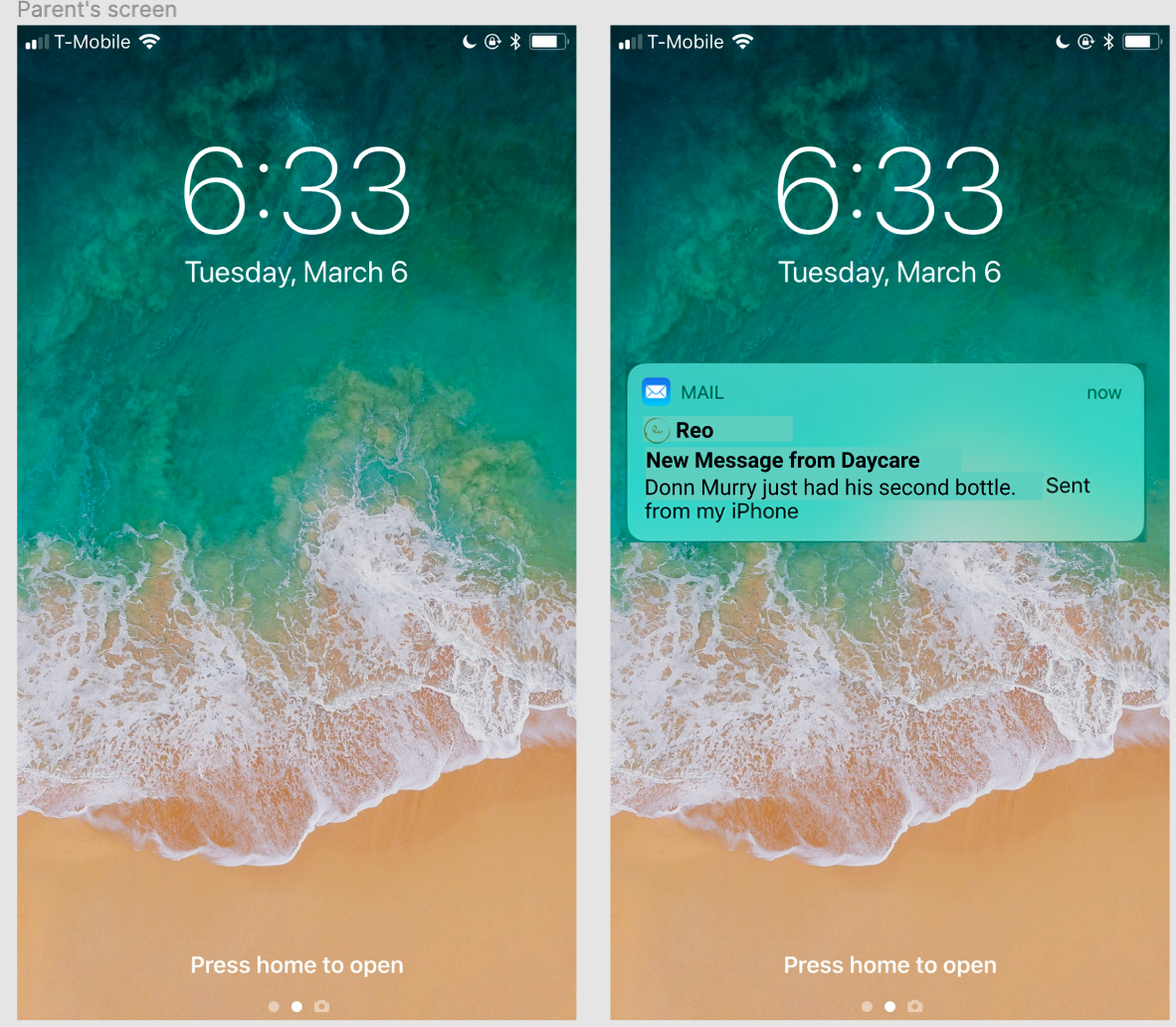
Based on input from parents, teachers, and professors, I made improvements. I sought additional input on the project from our TA and fellow designers. I developed a high-fidelity version of the app with more message updates, profile details for each child, and clearer text.
Accessibility
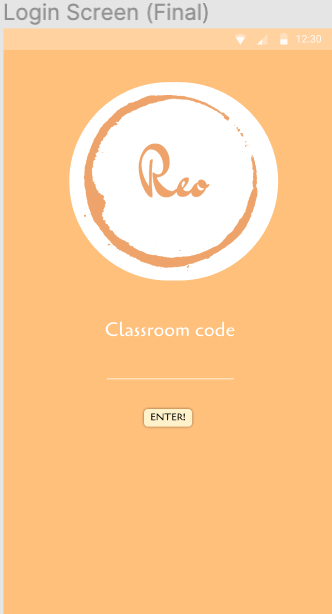
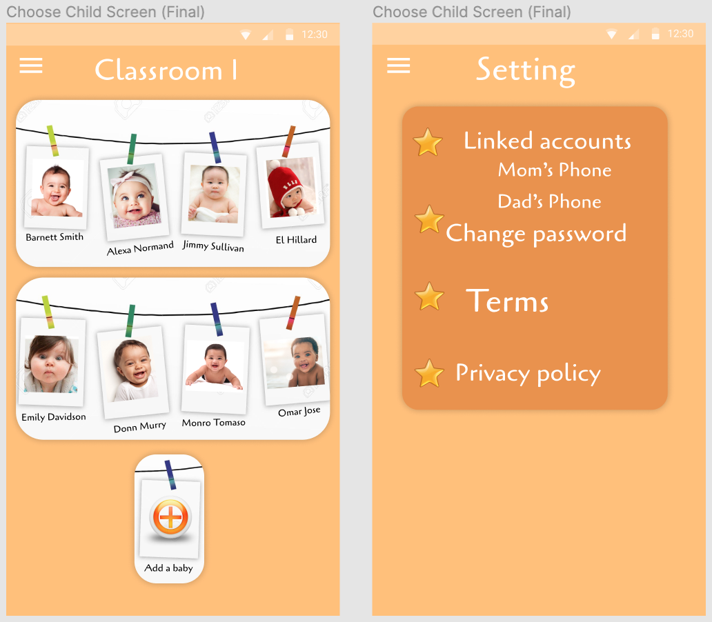
Each teacher will be given a unique code to use to log in. As a result, each child's information is kept private and confidential.
Final Prototype
After many tests and iterations, my final product aligned with all of the objectives, I had set in place. It includes the three core features necessary for users to find reports quickly and easily while appearing visually appealing and simple to use.

Click here to view the final product.
Click here to view award received.